Video: Just Add Color Inspiration | Pencil Coloring on Kraft with Debby Hughes
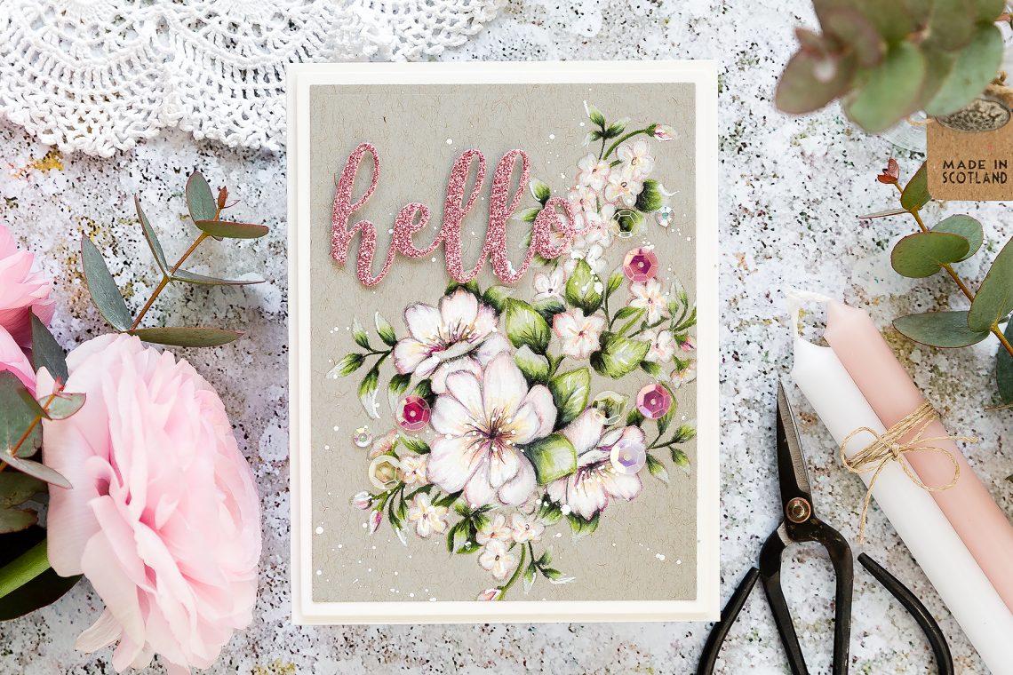
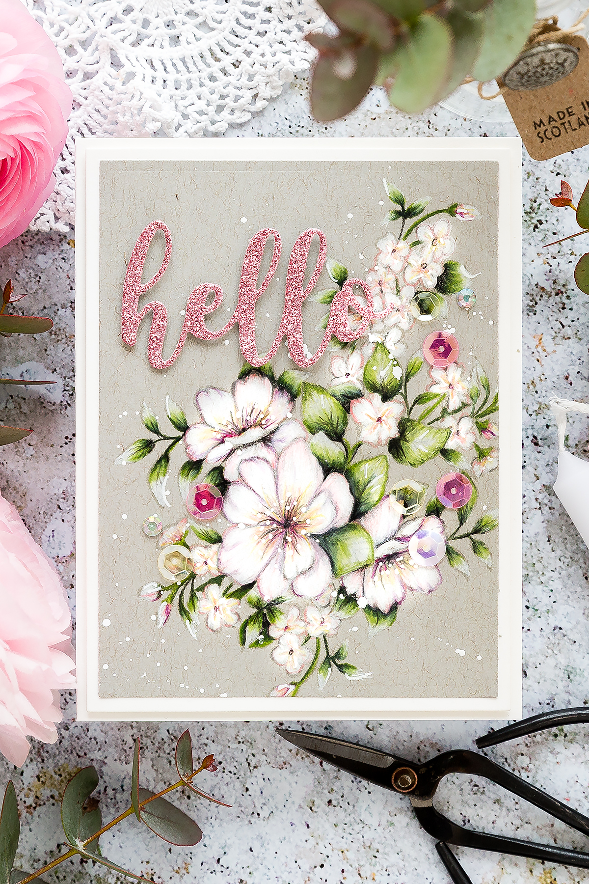
Hi, Debby here from Lime Doodle Design and I’m delighted to be here at Spellbinders today. In my video below I’m using the beautiful new Peonies Blossoms set from Stephanie Low and one of my most favourite ways to colour – pencils on kraft. The Peonies Blossoms set has four lovely floral clusters set on a red rubber, cling mount system which means you are going to get that beautiful fine line detail from the red rubber for these delicate blooms. I paired the stamp set with the Strathmore Toned Gray paper. I love the cooler grey tone of the paper, and its smooth surface makes stamping and colouring a dream.
VIDEO TUTORIAL
Watch the video tutorial below or on YouTube to learn how to make this project:
PENCILS ON KRAFT
I took out the four flower clusters and played around with an arrangement on the paper. I then transferred the paper to a Mini Misti and stamped the main cluster which will become the focal point of the arrangement in clear embossing ink from Simon Says Stamp. I plan to colour these flowers in a no-line style, and the darker tone on tone look of the embossing ink will give me a guide to colour and yet will blend in with the colouring to leave that natural no-line look that I love. I stamped the image twice to get a clear impression, and then I stamped the image again on masking paper in Smoke ink and trimmed the mask out with scissors before applying it over the stamped image on the paper. This way I can stamp the other three clusters around the focal point without worrying about lines overlapping. I continued double stamping the three other images around the central flower cluster until I had a full bouquet to colour. I removed the mask and then set to with my Faber Castell Polychromo pencils.
I prefer Faber Castell Polychromo pencils over Prismacolor pencils as they sharpen to a harder, fine point and I like that for my style of colouring and adding details. It’s all personal preference, and I know many people love the Prismacolor pencils for their softer lead which lays down colour easily.

Whichever medium I am colouring with be it pencils, Copic markers or watercolours, I start by thinking about the shadows and highlights. Where is the light source coming from? Where will shadows be cast and where will highlights catch the light? With flowers, I usually place the shadows in the centre of the flower because the petals arching out from the centre will often result in the flower centre being deeper set in the bloom and so in the shade. For highlights, I usually add those on the middle of each petal. I think of the petal arching out from the shadows of the centre of the flower and the light catching the body of the petal and then the top of the petal continuing to curve away from the light slightly. I think of the leaves in a similar way for the highlights, and for the shadows, the leaves are often tucked under the flowers and so the point that they dip under the flower that area will be in the deepest shade.
To start colouring I like to mark out the highlights with a white pencil, this way I can try and protect those areas when colouring so that I don’t lose the highlights. When colouring the leaves, I then brought in a mid-tone green to colour around the edges and for the shadows I used a darker green as well as black. I find that black works well to deepen the greens in the shadows and when blended out with the other colours I don’t think you see the black anymore your eyes just register deep shadows. I tested this colour scheme on one leaf and then worked my way around the bouquet colouring all the leaves in the same manner. As I progressed, I moved from colouring each leaf individually to batch colouring in that I coloured the one colour over various leaves before moving on to the next colour and this helped to speed up the process slightly.
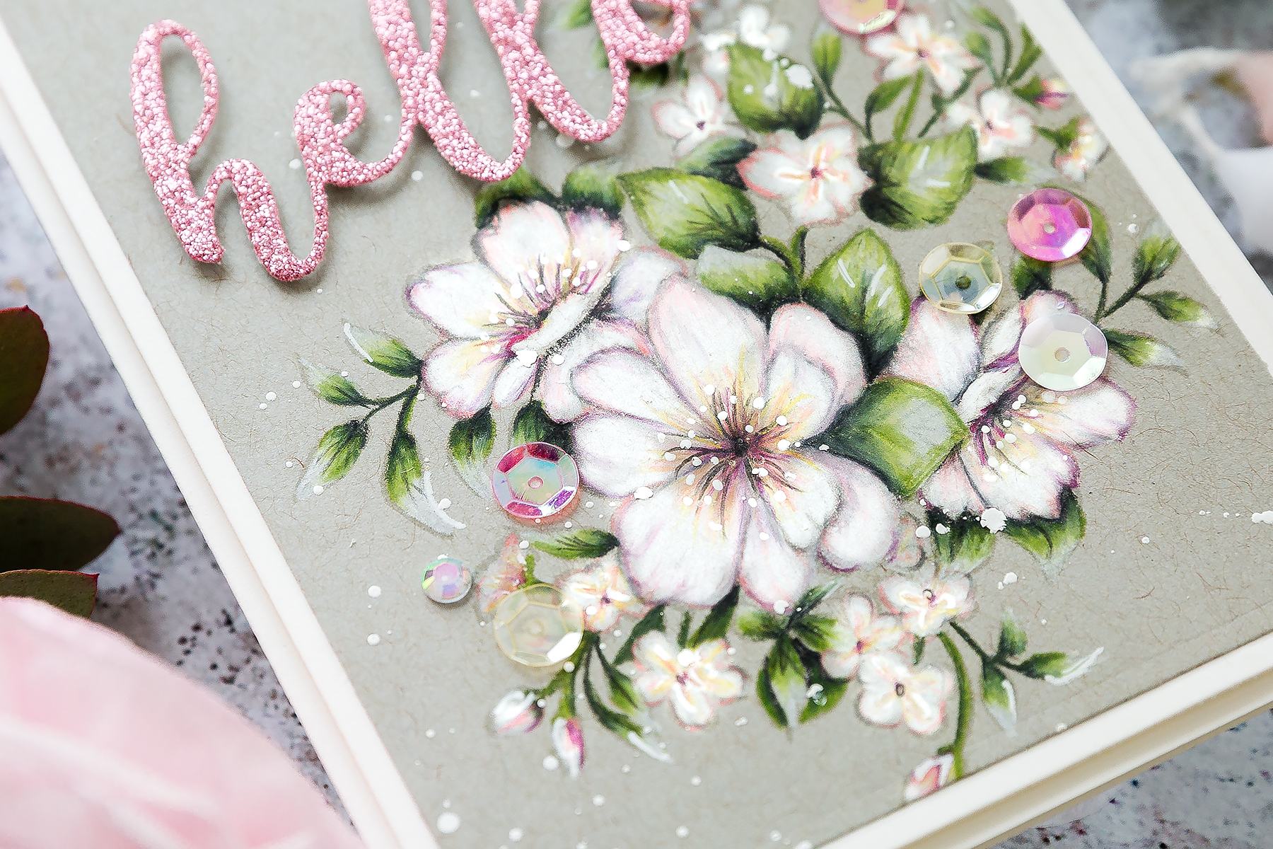
Moving on to the flowers and I had planned on colouring them a pink, however, once I’d coloured all the leaves, I really liked the green and white together on the Toned Gray paper. I have a preference for white flowers, and my wedding bouquet was lots of green leaves and a few white flowers. So, when I started to colour the flowers, I knew I wanted to keep a lot of white in there but equally I wanted to create shade and dimension. I started by using the white pencil and pressing that bit firmer to make the white pop, then to bring in the shadows and add interest I played around with a few options. I used a grey pencil to define the petals and to add some shading, but I didn’t want the flower to end up too dull, and so I pulled out more colours of pencils but just used small amounts of them. So, a little yellow for the centre, a bit of light pink around the tips of the petals. I often like to use a lilac for shadows, and so I tried a little of that then I added some deeper magenta here and there. Even some black for the flower centres. I just kept playing until I felt the flowers still read as white but equally weren’t flat and lacking dimension.
I coloured the three main focal point blooms with more detail and then for the smaller flowers I wanted to keep the colouring on those less detailed so that the eye was drawn to those big blooms in the centre of the bouquet. So, for the small flowers, I added the white pencil again and then just pops of colour here and there. I finished off the colouring with a black pencil to deepen the shadows here and there and then moved on to adding some details with a white gel pen. In comparison to the white pencil, the white gel pen gives pops of opaque white which stand out and help to brighten the image.

I used a white gouache paint and a brush to finish off with a little splatter. I then dried the paint with a heat tool and once dry I pulled out the A2 Matting Basics A die set and chose a die which framed the flowers nicely. I ran that through my Spellbinders Platinum 6 die cutting machine. As you can see, I use this all the time, and my plates could do with replacing. I then got out the A2 Matting Basics B die set and chose the die just slightly larger than the one I’d used from the A set, and I cut this from Ivory card from Simon Says Stamp. I added Gina K glue runner to the back of the grey paper and matted it onto the Ivory card.
Moving on to the sentiment and I chose to use one of the dies from the Hello Expressions set. There’s a lovely script hello die in the set, and I chose to cut it from some pink glitter card from Simon Says Stamp. I thought the pink brought out those hints of pink and lilac that I’d coloured around the edges of the flower petals and you can’t beat a bitter or sparkle too.

With all the elements to this card ready I started to put it together. I added foam adhesive to the back of the Ivory panel and then adhered that to an Ivory card base. I then added thin strips of foam adhesive to the back of the hello die cut and adhered that to the perfect blank spot on the card front. As a final accent, I used Iced Sherbet sequins and gems from Little Things By Lucy’s Cards and kept those in place with Gina K Connect glue.
Spellbinders Supplies:
Other Supplies:
Media – Faber Castell Polychromo pencils, Winsor & Newton white gouache; Ink – Simon Says Stamp clear embossing ink, Simon Says Stamp Smoke ink; Card – Strathmore Toned Gray, Simon Says Stamp Ivory, Simon Says Stamp masking paper, Simon Says Stamp rose gold glitter card; Embellishments – Little Things By Lucy’s Cards Iced Sherbet sequin mix; Adhesives – Gina K glue runner, Gina K Connect glue, 3M foam adhesive; Other – Uni-Ball White Gel Pen, Perfect Pearls brush, Mini Misti, T square ruler, Cutter Bee scissors, pencil sharpener
I want to thank you for joining me today, and if you want to see more from me, then please pop on over to my blog Lime Doodle Design where you will find regular videos from me as well as links to all the usual social media channels.
6 Comments
Tricia Podmore
Wow what a stunning card and the cluster of flowers are striking and appear so lifelike. You are an amazing colorist. Thank you for sharing your talents
Pooja
It’s so beautiful !! I loved the no line pencil colouring a lot !! Thanks a lot for the video and detailed post
scraphousemom
Debbie, this is so beautiful! I appreciate all your details about how you colored. I can use them!
Ruth Hansen
This is the most beautiful pencil card I have ever seen. I have saved your work in my craft file so I can view it again for inspiration.
Debbie F.
Gorgeous coloring! I love to color flowers with pencils. This video has some tip and ideas for coloring that I’m anxious to try. I’d given up on the gray toned paper for a number of reasons, but now I’m going to get it back out and try it again … starting with using white pencil! Thank you so much!
Becky Green
ABSOLUTELY STUNNING!!! They look LIFE LIKE! JUST GORGEOUS!!! 😉