-
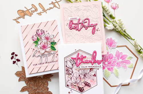
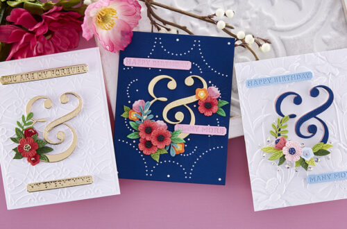
April 2024 Embossing Folder of the Month Preview & Tutorials – Faux Stitched Petal
Our April 2024 Embossing Folder of the Month preview & tutorials are here! Exclusive Embossing Folder adds texture and dimension to any project. Size will generally be 5.5″ x 8.5″ and can be used to make slimline, 5″ x 7″, and a variety of sized projects. Please note, new Subscription Sign-Up Window will now open on the 6th of each month and close on the 27th (once existing club members subscriptions have been processed.) If there is additional inventory remaining, then they will be made available for new subscriptions and will have limited availability. Continuing Subscriptions will charge on the 5th of each month. This means existing Club Members will…
-
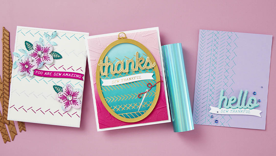
April 2024 Glimmer Hot Foil Kit of the Month Preview & Tutorials – Sew Amazing
Our April 2024 Glimmer Hot Foil Kit of the Month Club preview & tutorials are here! The Glimmer Hot Foil membership subscription includes an exclusive Glimmer Hot Foil Plate Set + One Roll of Foil (colors may vary). Please note, new Subscription Sign-Up Window will now open on the 6th of each month and close on the 27th (once existing club members subscriptions have been processed.) If there is additional inventory remaining, then they will be made available for new subscriptions and will have limited availability. Continuing Subscriptions will charge on the 5th of each month. This means existing Club Members will still be able to cancel subscriptions or make…
-
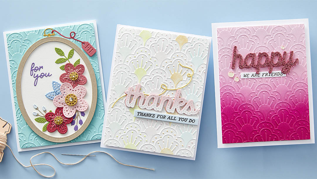
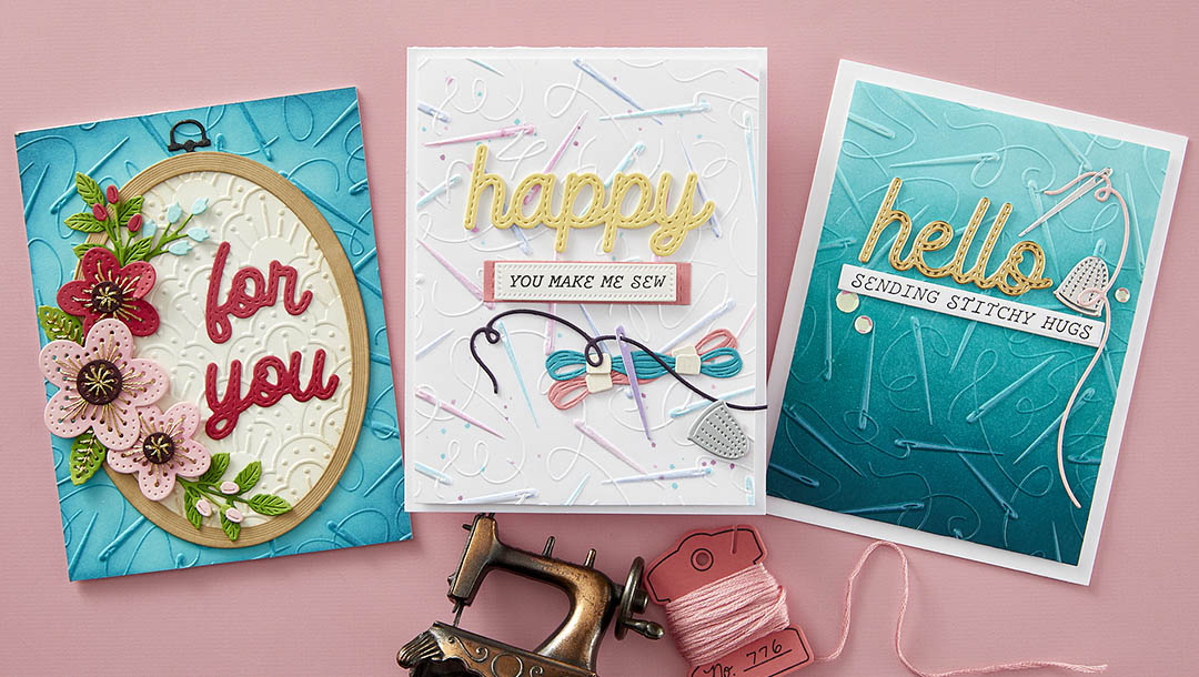
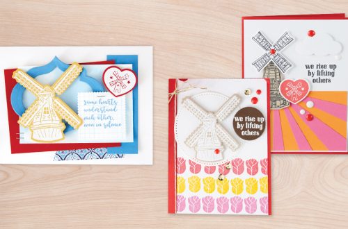
April 2024 3D Embossing Folder of the Month Preview & Tutorials – One Stitch at a Time
Our April 2024 3D Embossing Folder of the Month preview & tutorials are here! Exclusive Embossing Folder adds texture and dimension to any project. Size will generally be 5.5″ x 8.5″ and can be used to make slimline, 5″ x 7″, and a variety of sized projects. Please note, new Subscription Sign-Up Window will now open on the 6th of each month and close on the 27th (once existing club members subscriptions have been processed.) If there is additional inventory remaining, then they will be made available for new subscriptions and will have limited availability. Continuing Subscriptions will charge on the 5th of each month. This means existing Club Members…
-
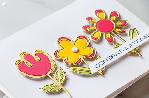
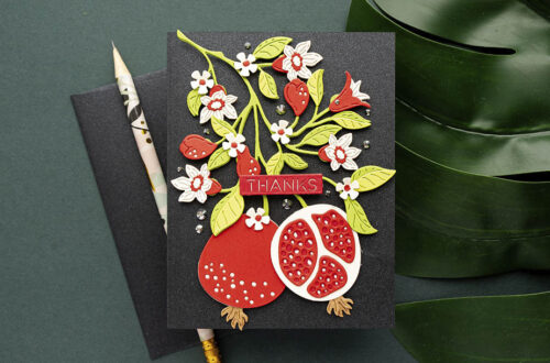
Graphic Stylized Design with The Fresh Picked Collection
Hello crafters! Joan Bardee here to share some fun colorful cards made with the Fresh Picked Collection. Recently I’ve seen a lot of graphic stylized designs – large florals, fruits, or other images – manipulated so that they fit into a rectangle or other shape like a puzzle. Some describe this design as mid-century modern. You can see examples by checking out my Pinterest page here. In addition, the November Large Die of the Month Towering Blooms is also in that style. The Fresh Picked Collection has that bold aesthetic and I absolutely love it. The collection consists of 4 die sets – Buttercups, Daffodils, Berries, and Anemones. There is…
-
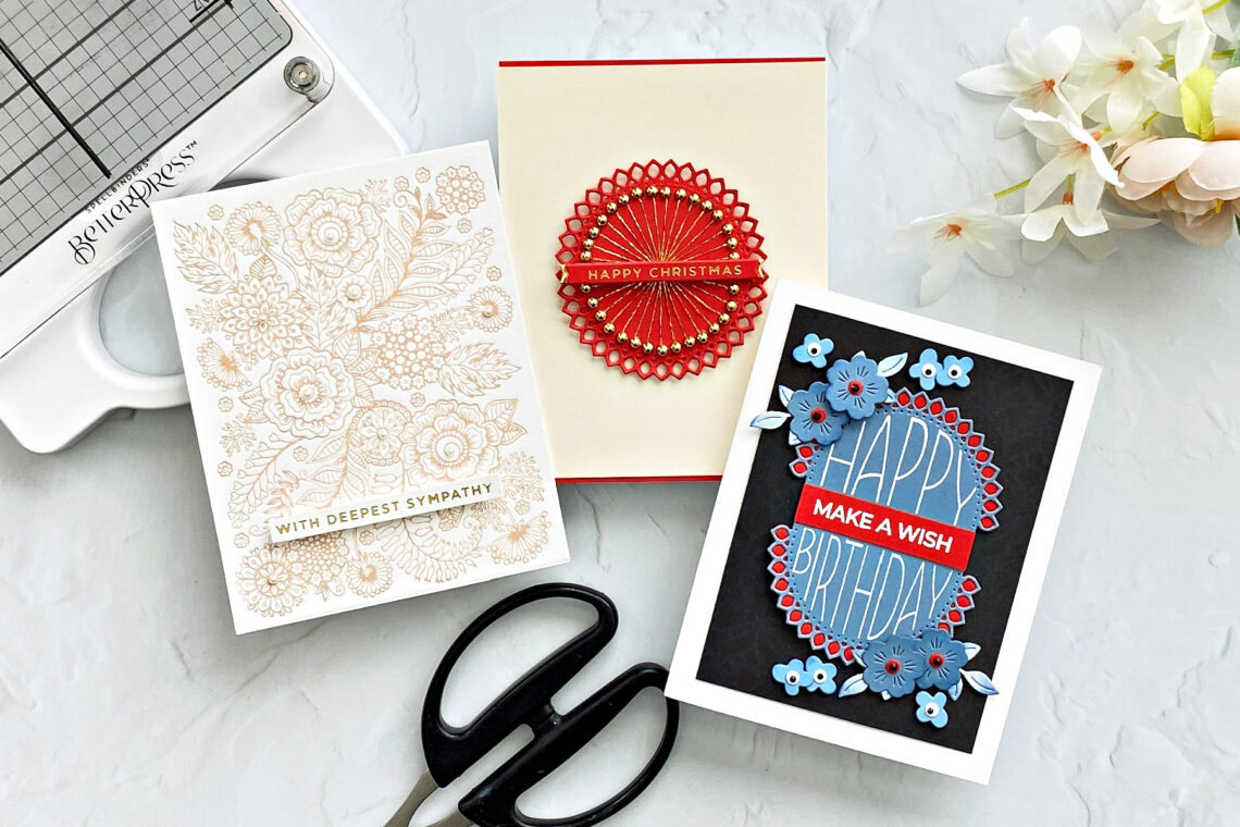
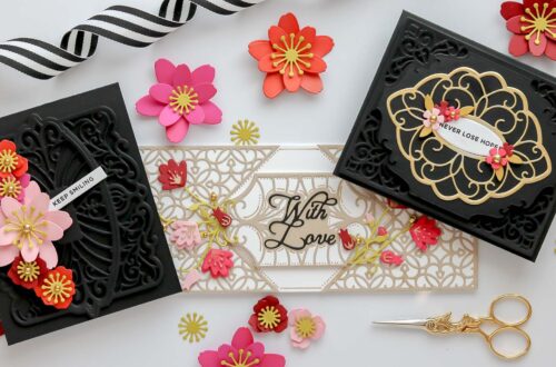
Kaleidoscope Arch – Versatile Products Rock!
Hello crafters! Joan Bardee here. Today I’m sharing a few cards using the Kaleidoscope Arch Collection. This collection has a little bit of everything – beautiful dies, a coordinating clear stamp set, and a gorgeous BetterPress LetterPress plate. I love products that can be used in different ways. Versatility keeps us from getting bored and stretches our crafty dollars. Here are a few ideas. Quick and Elegant Sympathy Card Confession: I rarely make sympathy cards. My cards seemed too “crafty” for such a solemn occasion. But the BetterPress LetterPress produces professional quality results – one that is worthy of a sympathy card. Ink up the Kaleidoscope Flowers Press Plate with…
-
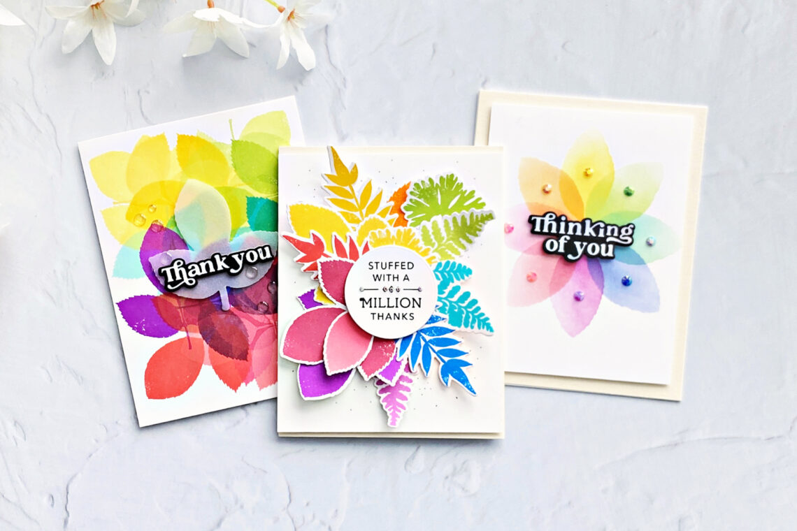
Vibrant Rainbow Palette Using Simon Hurley’s Leaf Prints
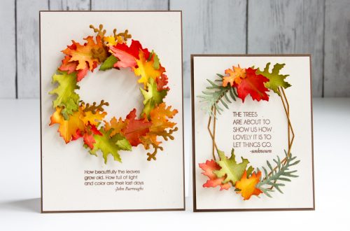
Hello crafters! Joan Bardee here and I’m happy to be back on the Spellbinders blog sharing 3 bright, colorful cards using Simon Hurley’s Leaf Prints stamps and dies. Leaf Prints is a set of beautiful solid (no coloring!!) red rubber stamps of leaves and there is a coordinating set of dies available. Leaf Prints is perfect for fall cards, and normally I would go with a typical autumn color palette, but I used a vibrant rainbow palette instead and I love how they came out. Although, when you get to the 3rd card, you’ll see I’m second-guessing myself. Let me know what you think. RAINBOW BOUQUET This card packs a…
-
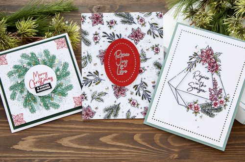
Using the Beautiful Wreaths Collection Without Making a Wreath
Hello crafters! Joan Bardee here and I’m happy to be back on the Spellbinders blog sharing 3 cards using the Beautiful Wreaths Collection designed by the delightful Suzanne Hue. This collection will give you everything you need to make many different wreaths. There are many add-ons available that allow you to make cards for any occasion. I decided to not make any wreaths. Rather, I wanted to use the add-ons to demonstrate how versatile the collection is. Stylish Snowman I LOVE this dapper snowman – so stylish with his top hat and scarf. Die cut the snowman from Christmas Wreath Add-Ons using White, Brushed Black, Poppy Field, Pink Sand, Peridot,…
-
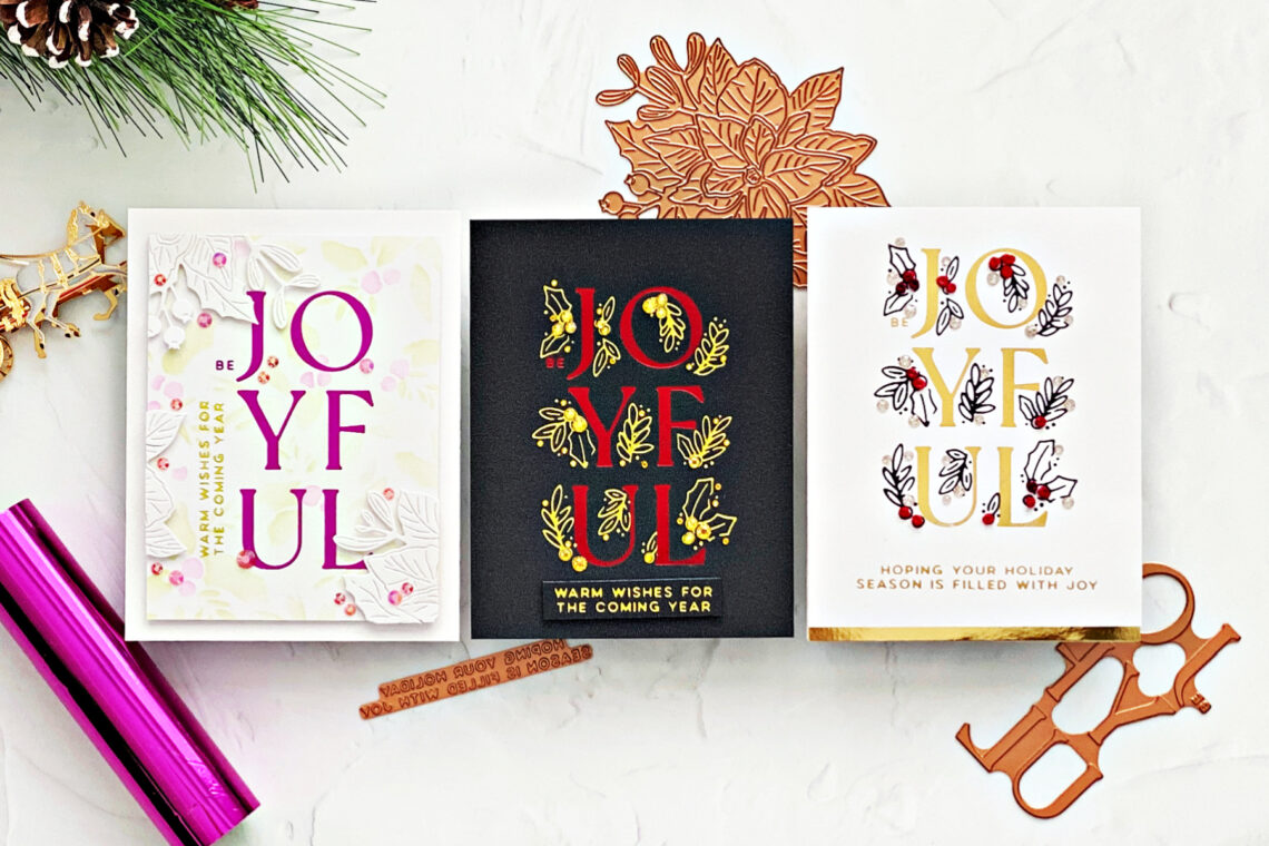
Making Clean and Simple Christmas Cards Special – Joyful Glimmer Step-by-Step Tutorial with Joan Bardee
Hello crafters! Joan Bardee here and I’m thrilled to be back on the Spellbinders blog featuring part of Yana’s De-Light-Ful Christmas Collection. It’s an amazing collection full of everything we love – hot foil, dies, stencils, etc. I am focusing on Joyful Glimmer, which consists of 2 hot foil plates – one sentiment plate and one holly plate that cleverly wraps around the sentiment. I love to go all out when I make Christmas cards and add those special elements that make the recipient go Wow. Even so, I love “clean and simple” cards. So, today I’m sharing a few ideas to add special details to clean and simple Christmas…
-
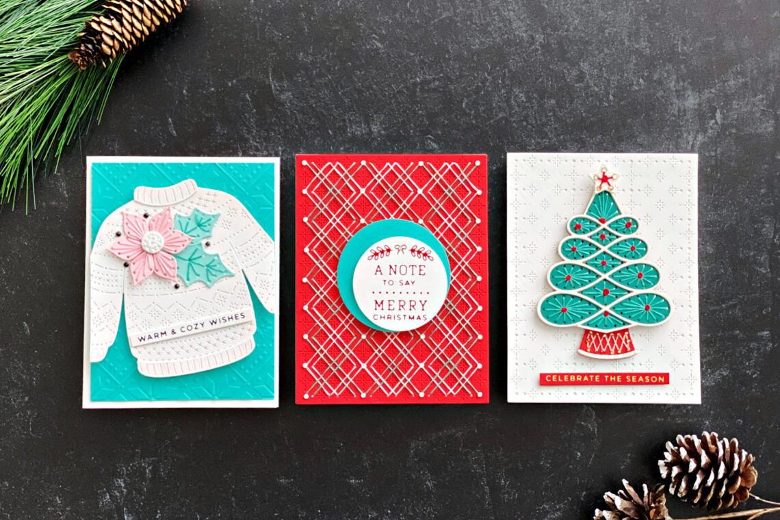
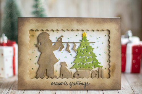
It’s Time to Get Stitching with Stitched for Christmas!
Hello crafters! Joan Bardee here and I’m happy to be back on the Spellbinders blog sharing some holiday cards using the Stitched for Christmas collection. Yes, Christmas! I’ve been crafting long enough to remember when companies would release their Christmas products in November, which never left me enough time to use them. So, I am thrilled to see Christmas in July. Chose a slightly nontraditional Christmas color palette, substituting aqua or teal for green. Note: I made these cards before the sentiments in this collection were available, so I used sentiments from last year’s collections. Warm & Cozy Sweater This card was inspired by all the sweaters my mom made…
-
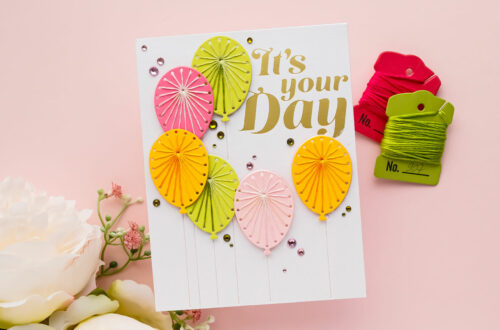
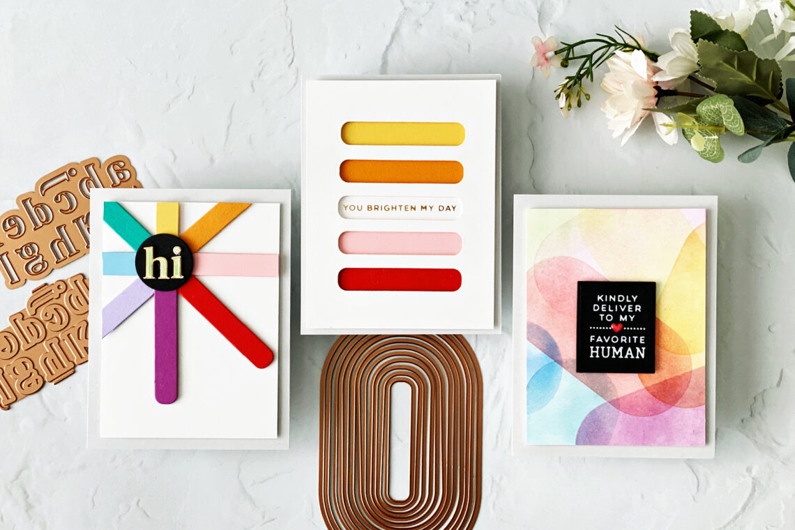
The Versatility of Shape Dies Using Products from the Sealed for Summer Collection with Joan Bardee
Hello crafters! Joan Bardee here and I’m happy to be back on the blog. Spellbinders recently released the Sealed for Summer collection, which includes a variety of beautiful products, including another set of “essential” shape dies – Essential Modern Ovals. I’m featuring that product today, as well as the Glimmer Alphabet. In addition to the new Essential Modern Ovals dies, Spellbinders has a line of shape dies (as opposed to dies that cut out a coordinating image) that are so versatile. These dies, such as, Hexi-Gems, Hearts, and Circles, can be the starting point for making colorful, graphic, geometric designs, as well as more traditional cards. Today I’m sharing 3…